Landcover Zonal Statistics.
An automated workflow to assess Landcover by region using the CORINE Landcover dataset.
Technologies Used: QGIS, Python, Jupyter Notebook
Description
This Python script streamlines the visualization of land cover distribution across various regions using the CORINE Land Cover dataset. It supports creating pie charts and stacked bar charts, leveraging Plotly for interactive and dynamic visualizations. This allows to analyze landscape composition at multiple levels of land cover aggregation, making it versatile and adaptable to various datasets and land cover categories. This flexibility makes it an invaluable tool for conducting quick, insightful land cover assessments and comparisons.
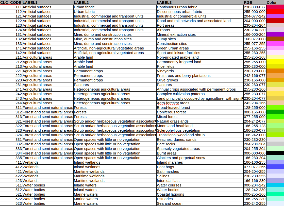
The landcover dataset provides 3 levels of aggregation, from Level 1 (most broad) to Level 3 (most detailed), with a standardized color scheme:
Using the same legend, here are a few examples of how this visualization can be helpful to compare landcover:
Example 1: Landcover for each of the 16 states of Germany (Bundesländer) - Aggregation Level 2:
Example 2: Landcover for each of the 16 states of Germany (Bundesländer) - Aggregation Level 1:
Example 3: Landcover for the Canary Islands, Spain (Level 2)
Instructions
IMPORTANT:The workflow requires data preparation in QGIS before running the script:
- Load the input vector layer (zones) into QGIS, ensuring that there is a unique NAME field to differentiate the features.
- Load the desired CORINE Land Cover dataset (e.g., the .tif file for 2018:
U2018_CLC2018_V2020_20u1.tif). - Run the Zonal Histogram tool.
- Export the resulting output as a CSV file to be used in the script.
Back to my projects →