DEM Raster to 3D Plot.
This tool that dynamically extracts the data from a given DEM raster layer and plots it on a 3D graph.
Technologies Used: Python 2.X (OGR, Matplotlib)
This QGIS plugin plots a given digital elevation model (DEM) raster image with elevation values on an X,Y,Z 3D matoplotlib plot (QGIS version 2.X). Uses PyQGIS and Matplolib.
Description
Converting the data available within a raster to a 3D plot required the following data to be extracted from the raster image: X and Y of each raster cell and an elevation value (in meters). Further, to properly display the geographic coordinates (and not the image coordinates) in the plot required a transformation. Finally, the plot would consist of the X and Y axis representing longitude and latitude, and the Z axis representing elevation.
During the process, merely plotting these points in a scatter plot (as seen in Figure 1A) proved to be very CPU and time-consuming. Thus, a subset raster (3 by 2.5 kilometers) was clipped of the North Rhine Westfalia, Germany digital elevation model. Nonetheless, this proved still to be very slow to run, particularly when moving around the figure. This issue was solved by increasing the cell size in the raster, using ArcGIS’s geoprocessing tool – Aggregate. This tool resamples an input raster to a coarser cell resolution, specifying an aggregation method like sum, minimum, maximum, or average values (“How Aggregate Works”, 2017). The default NRW raster consisted of 5 by 5-meter raster cell size. Using aggregate, the cell size was increased to 100 meters, specifying average as an aggregation method. This greatly improved performance, yet understandably resulted in less far less points (Figure 1B).
Once the preprocessing of the raster was completed, the following steps were completed to plot the raster, first as a simple mesh grid and then to interpolate the data between the points to a ‘flying carpet’:
Extracting X, Y, elevation and projection metadata from the raster using GDAL
The first step was to provide a path to the appropriate raster, open the raster using GDAL and getting the geographic transformation information from the image coordinates to geographic coordinates
using the GetGeoTransform function. Next, the raster information (variable ‘dem’) was extracted to a NumPy array. The variables cols and rows were used to store the X and Y cell size respectively,
and were used to create the two new NumPy arrays that converted image pixel values to the geographic coordinates in the raster’s metadata. The conversion was done by setting the dimensions in each array
to match the image pixel array dimensions, and applying the cell size. Finally, these X and Y arrays were then finally converted to a mesh grid using the np.meshgrid function.
Plotting the mesh grid
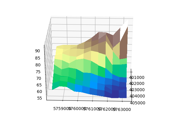
So far, creating the mesh grid allowed 3-dimensional plotting using correct coordinate and elevation data. The result is seen in Figure 1C, in which each point’s value from the scatter plot (Figure 1B) was used as the value for an entire surface ‘block’ in the mesh grid. This was done to demonstrate and plot a simple mesh grid from the data, and provide a solution to create a flying carpet from a given raster layer. However, this solution is coarse, as no interpolation has taken place between each point containing a raster value.
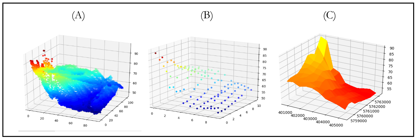
Figure 1: The visualization of the DEM raster data. (A): A scatter plot of a raster with resolution 10x10 meters. (B) A raster with resolution of a 100x100 meters. (C) A mesh grid of the 100x100 meter raster, with geographic coordinates as axis labels.
Interpolation of raster data
A second approach was aimed at representing the raster using interpolation. This made use of Matplotlib’s griddata function, that interpolates from a nonuniformly spaced grid to some other grid . The first step of the process was similar, by retrieving the x, y, and z values from the raster image. Two 2D grids were constructed (‘xi’, ‘yi’) using np.linspace and the maximum/minimum x and y values as arguments and a mesh grid was constructed (‘X’,’Y’). Next, a linear interpolation took place to calculate interpolated Z values using the griddata function, with the x, y, z, xi and yi as arguments. Finally, the three X, Y, and Z arrays were plotted, as seen in the Figure 2.
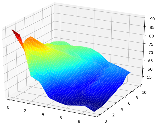
Figure 2: The 100x100 meter raster plotted after a linear interpolation using the griddata function.
The result, in comparison with Figure 1C is more detailed, allowing to see gradual differences within the raster cells, albeit interpolated and not real. The orientation of the plot is inverted, as the plot utilizes image coordinates and not geographic coordinates. Using geographic using this method proved to be difficult, with the interpolation function returning values that were not on the graph. Nonetheless, this allows the user to notice more subtle differences in elevation that better reflect reality than the mesh grid approach.
Code
This code is a ready-to-run Python 2 script, with the only required installation of GDAL and OGR, available via PIP install. See the GitHub version for the QGIS 2.18 plugin version.
            import gdal, ogr, os , osr
            import matplotlib.pyplot as plt
            from matplotlib import cm
            import numpy as np

            ##Open Raster
            in_path = os.path.join ("C:\\Users\\ngavish\\Data\\DEM_100meter.tif")
            test = gdal.Open(in_path)
            gt = test.GetGeoTransform()

            #Read data from raster as numpy
            dem=test.ReadAsArray()

            #Get cell size
            col = test.RasterXSize
            row = test.RasterYSize

            # col, row to x, y
            x = (col * gt[1]) + gt[0]
            y = (row * gt[5]) + gt[3]
            xres = gt[1]
            yres = gt[5]
            X = np.arange(gt[0], gt[0] + dem.shape[1]*xres, xres)
            Y = np.arange(gt[3], gt[3] + dem.shape[0]*yres, yres)

            # creation of a simple grid without interpolation
            X, Y = np.meshgrid(X, Y)

            # plot the raster
            fig, ax = plt.subplots(subplot_kw={'projection': '3d'})
            surf = ax.plot_surface(X, Y, dem, rstride=1, cstride=1, cmap=cm.terrain,linewidth=0, antialiased=False)

            plt.show()

            #Optionally save the image
            #plt.savefig("C:/Users/ngavish/Data/DEM_plot.jpg", dpi=100, format="jpg")

            #Optionally animate image
            #for angle in range(0, 360):
            #    ax.view_init(30, angle)
            #    plt.draw()
            #    plt.pause(.001)